It’s more than just font, size and color. Martin Roberts offers a 60-second dissection of some of his favorite home furnishings logos.
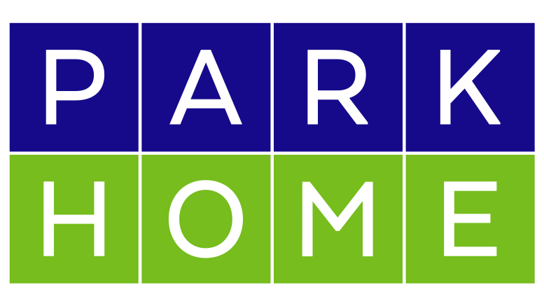
Good branding communicates what you stand for as a business. That branding can be communicated verbally or visually. We’re kicking off a five-part series featuring retail designer Martin Roberts, who’ll discuss the logos he helped recreate for four retailers. This week, Martin looks at Park Home. The Pennsylvania store started out as a retailer for car audio systems before converting to a store for furniture, mattresses and appliances.
“Typography has a power impact,” says Martin. “If used properly a company’s sign helps customers quickly come to understand you and what you offer. In the case of Park Home, we wanted a simple design that showed a modern product with value. We did this by incorporating a sans serif font. A serif font often looks high-end or fancy and gives a sense of luxury and expense. This logo is clean, simple and bold. It conveys value.”


